
Typography Poster
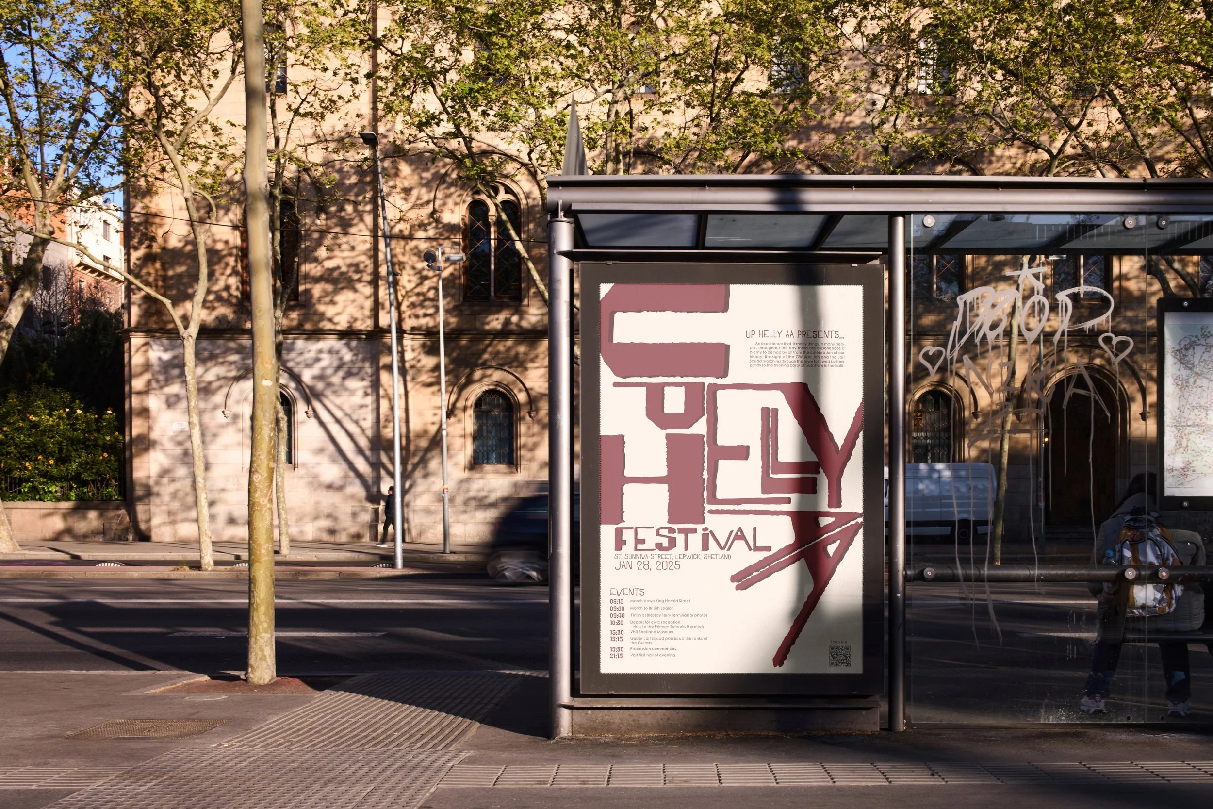
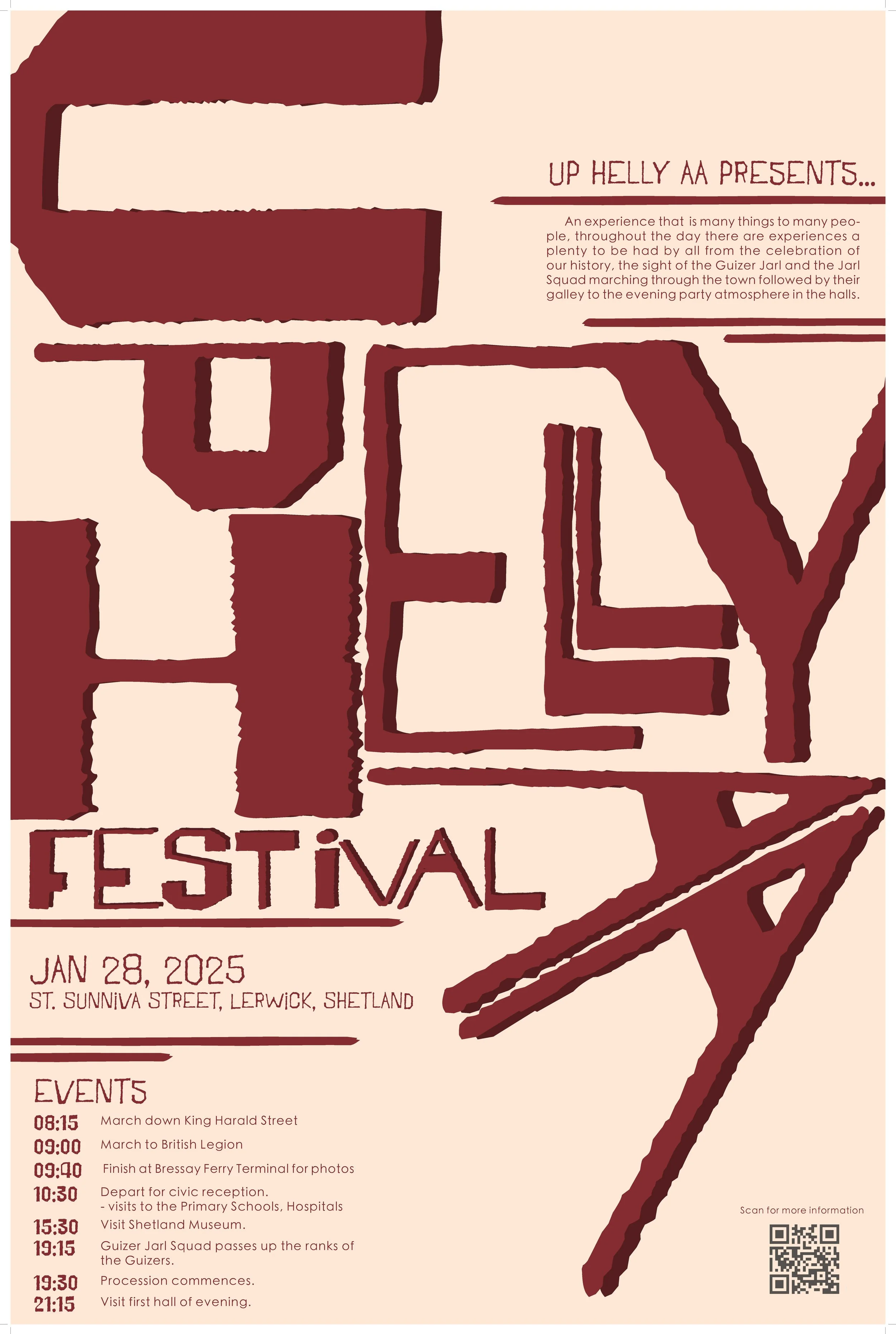
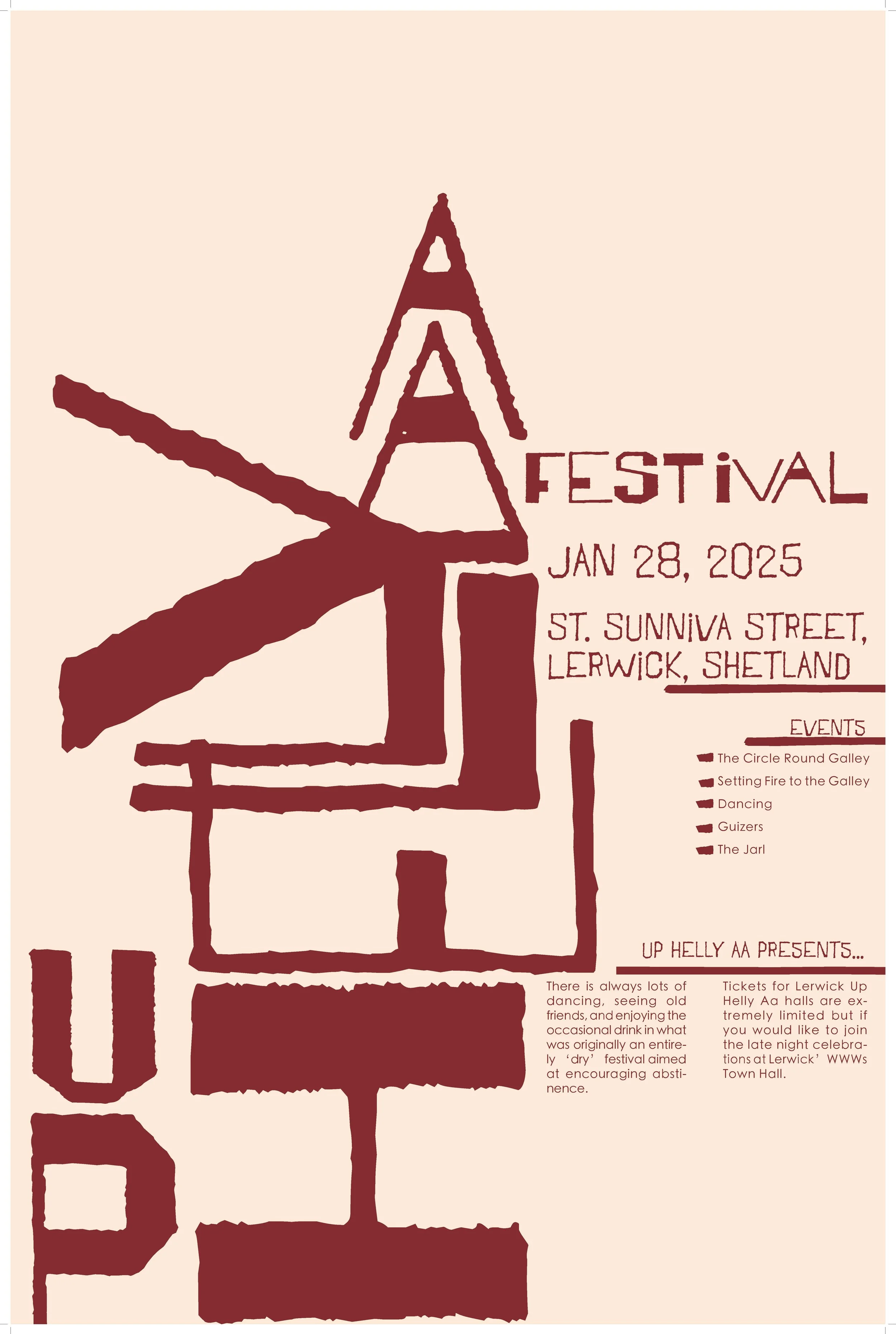
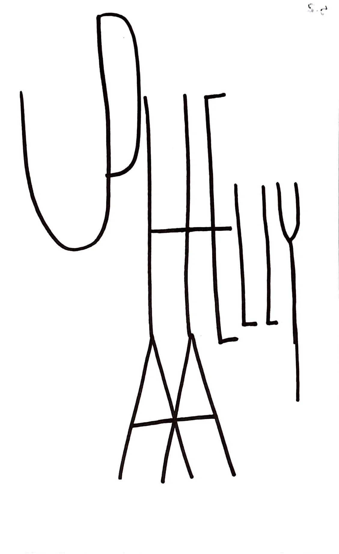
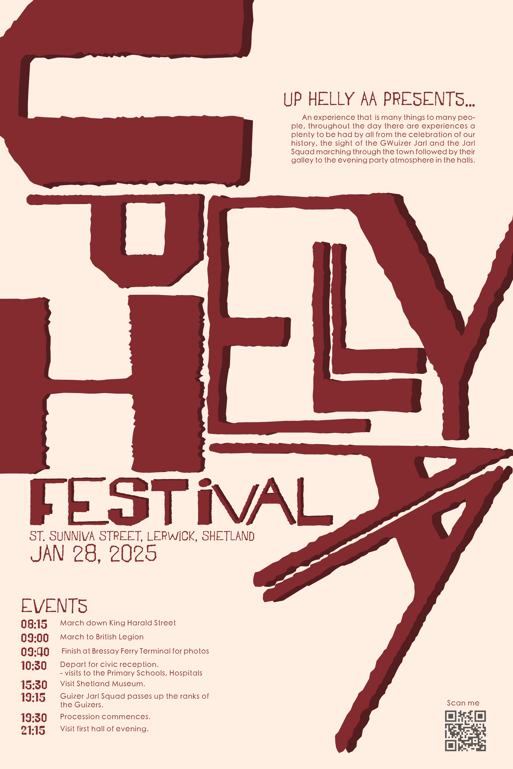
The rebrand poster design for the Up Helly Aa festival is fueled by bold storytelling through its type manipulation. Inspired by the festival’s fiery energy and Viking heritage, I used dynamic letterforms to reflect movement, energy, and a sense of traditionally. The shapes of the type mimic flames and ridged forms, creating a visual rhythm that echoes the spirit of the celebration. Each typographic choice is intentional, meant to capture both the historical roots and the exciting enviornment. Through this design, I aimed to honor the festival’s unique identity while pushing through conflicts with arrangement and the variation of design elements.
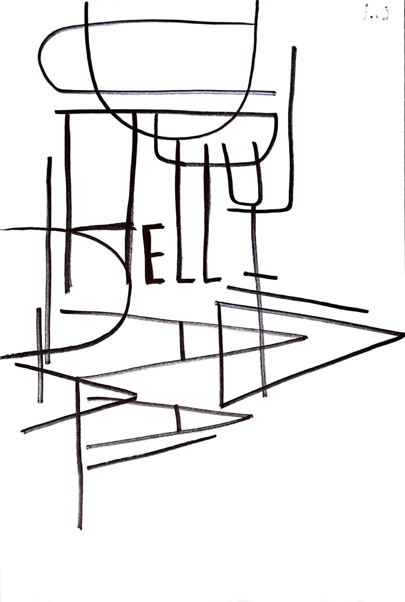
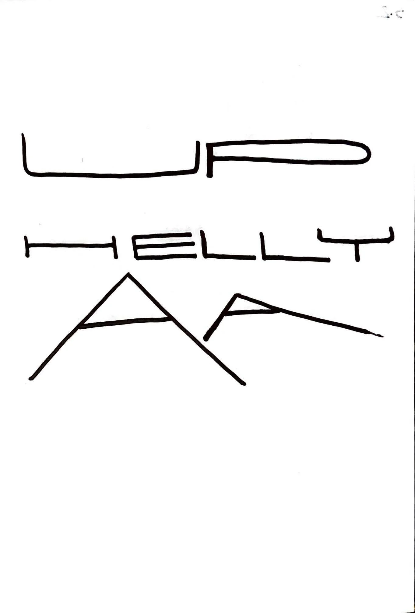
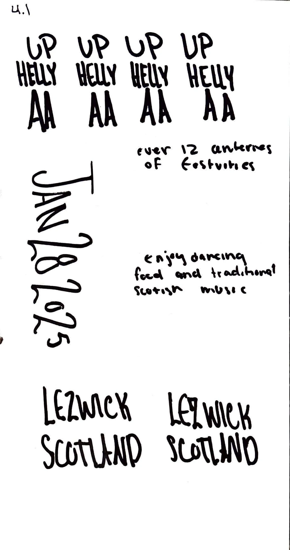
Process